


The right calendar screen is the one your household will actually see and update every day. For most families, that means a visible 15-inch to 24-inch display in the kitchen or entryway, backed by reliable phone sync and simple meal and chore tools.
If your week lives in text threads, sticky notes, and one parent’s memory, the problem is usually not effort. Families who outgrow a 10-inch screen often do it because they need enough room to show the whole week, dinner plans, and shared tasks at once. This guide will help you choose the size, placement, and feature mix that fits real home life.
Start With the Planning Problem You Actually Have
A calendar screen is mainly a visibility tool
A family command center works best when it acts as a shared home hub for the things people ask about every day: schedules, meal plans, chore lists, mail, and school papers. That matters because a screen is not just a calendar. In a busy house, it is a public reminder that everyone can see without opening a phone.

A second pattern shows up across family command center examples: the setup works when it answers recurring questions fast. If your household keeps asking “What’s for dinner?”, “Who has pickup?”, or “Did anyone sign the field trip form?”, you need one visible system that brings those answers together.
A screen will not fix paper clutter by itself
A good command center still needs a place for papers, mail, and small daily items like keys, pens, and notices. If forms are buried in backpacks or on the counter, even a great digital calendar will feel incomplete. That is why many strong setups pair the screen with a mail slot, hook rail, or a simple bin for school papers.
The simpler option is sometimes enough. A one-size-fits-all setup does not exist, so if your only problem is keeping a monthly family schedule visible, a whiteboard or a shared app may do the job without a dedicated screen.
Pick the Screen Size and Format for the Way You Read It
Small screens work best for light use
One real-world 10-inch wall tablet setup worked until the family wanted to show multiple calendars from a platform at the same time. They eventually moved to a 24-inch touchscreen because the smaller display did not leave enough room for a fuller shared view.
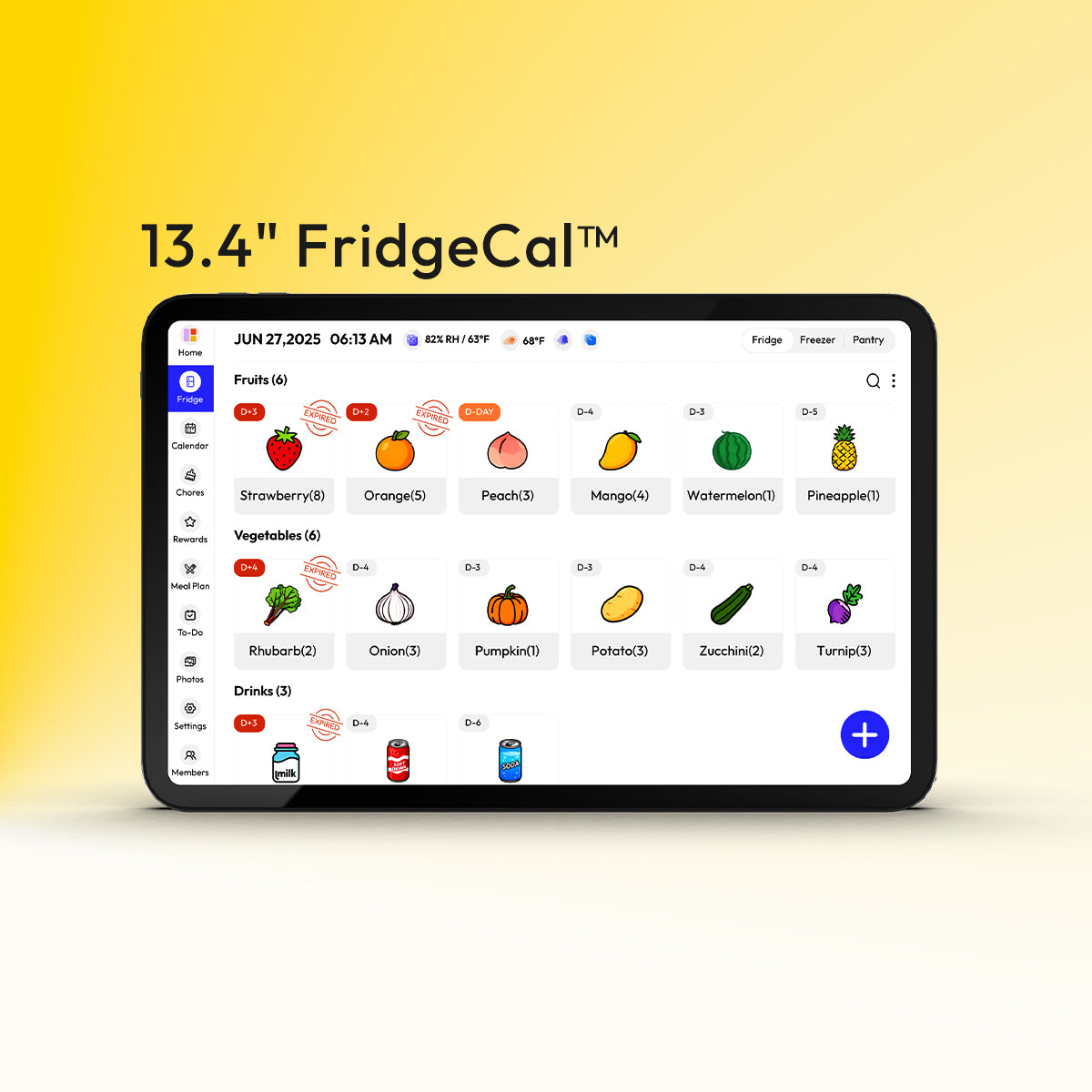
A 15-inch DIY touchscreen setup is a more comfortable middle ground for many homes. It is large enough for touch use, person-by-person filtering, and a week view, but still small enough for a countertop or a narrow wall. That size often fits families who want a shared calendar plus a few meal or chore controls without turning the wall into a project.

Larger screens help when the calendar is the household dashboard
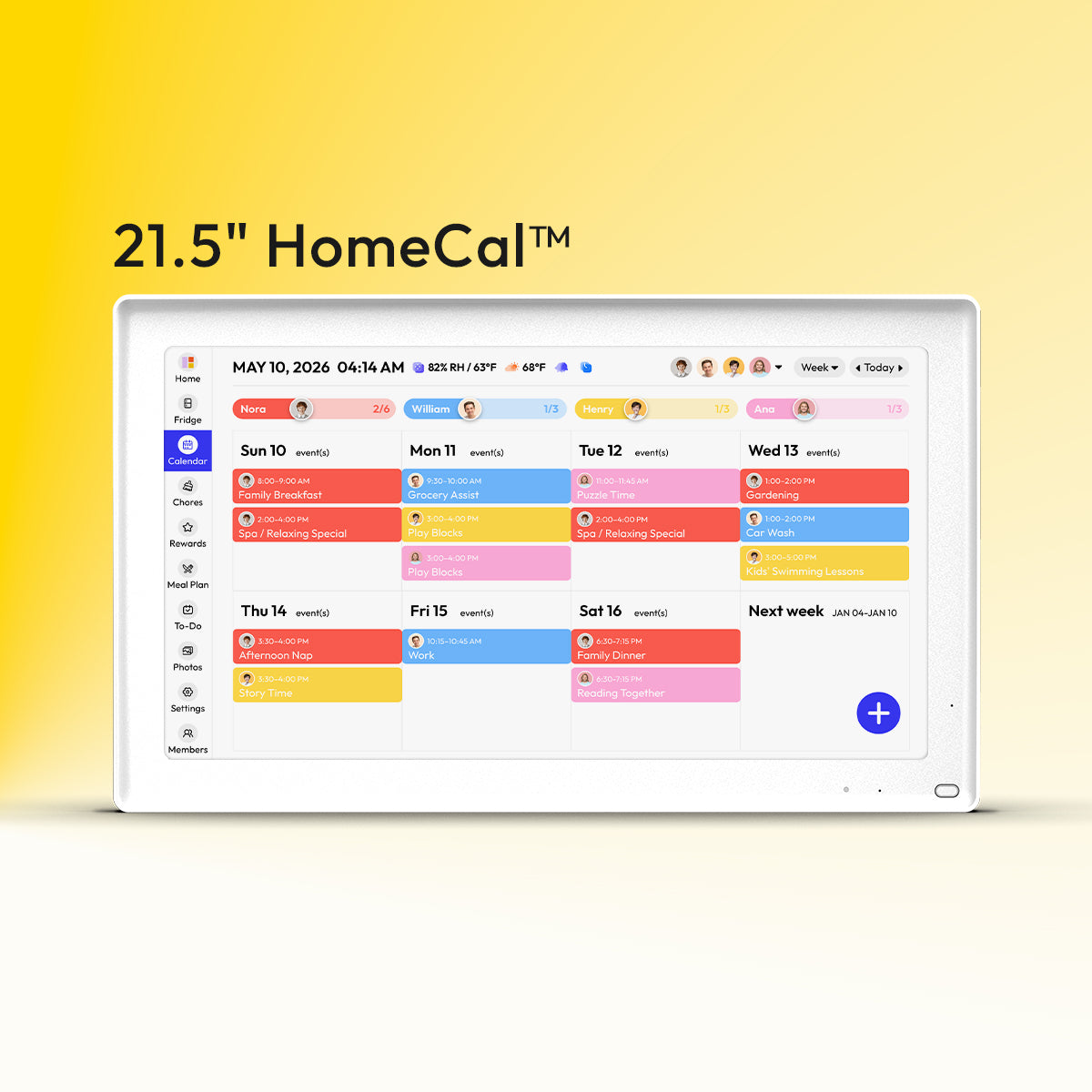
A portrait-style digital command center build shows why bigger can be better when the calendar is the main planning surface. A taller screen gives you more room for a day or week layout, which is useful when you want meals, chores, and appointments visible at the same time. A 21.5-inch wall-mounted option such as the Everblog 21.5" Digital Calendar sits in that larger-format range, where plans, tasks, chores, and events are easier to view together on one screen.
A broader digital family calendar comparison also makes the cost trade-off clear. Small dedicated family screens can start around $169.99, while larger models can reach $599.00. That is worth paying only if the display solves a real visibility problem in your home.
Option |
Best for |
Main strength |
Main drawback |
Typical fit |
Paper or dry-erase command center |
Budget-first families |
Always visible, very cheap, easy for menus and chores |
No auto-sync |
One shared wall in kitchen or mudroom |
App-only family organizer |
Families mostly coordinating by phone |
Strong remote updates and reminders |
Easy to ignore at home |
Split schedules, frequent travel, co-parents |
10-inch to 15-inch screen |
Small kitchens, countertop use |
Shared visibility with touch control |
Can feel cramped with many calendars |
Couples or small families |
24-inch wall display |
Larger families, complex weeks |
Easier to read from across the room |
Higher cost and more wall space |
Multi-kid households |
DIY touchscreen dashboard |
Tinkerers on a budget |
Flexible and often cheaper if you reuse hardware |
More setup and maintenance |
Tech-comfortable households |
Put the Screen Where Family Life Already Happens
High-traffic beats hidden every time
A home command center works best in a central, high-traffic location such as the kitchen, entryway, mudroom, or laundry room. That sounds obvious, but it is one of the most common buying mistakes. Families sometimes place the screen where it looks neat instead of where people actually stop, unload bags, and check the day.

A small-house command center setup makes the same point in a practical way: choose the location first, then decide what needs to live there. In a small home, that might be one narrow wall. In a larger home, it might be a screen in the kitchen and a paper drop zone near the door.
Pair the screen with the rest of the routine
A command center often works better when it includes hooks, bins, and wall storage around the calendar instead of treating the screen as a stand-alone gadget. The family glance usually happens at the same time as grabbing lunch boxes, sorting mail, or checking a permission slip. Putting those touchpoints together reduces missed handoffs.
Placement also affects the screen shape. One portrait monitor build needed a sideways wall mount and a custom frame because the family wanted a vertical calendar view. If you prefer a full-week schedule and longer lists, portrait is often easier to scan. If you mostly want a dashboard with tiles, landscape can work well.
Demand Clean Sync and Easy Updating Before Fancy Features
Shared planning fails when updates are slow or one-sided
A useful family organizer needs shared calendar sync and anywhere access so adults can update plans from their phones and still trust the home display. If an event added at soccer practice does not show up by dinner, the screen becomes decoration.
A more advanced household may need a planning layer across work and family calendars, especially when one adult is juggling office meetings, pickup windows, and school events. In that case, the best system is not the prettiest screen. It is the one that lets you see overlap clearly and avoid double-booking.
Separate calendars by person, then combine them on purpose
One strong DIY example used separate calendars for each family member plus shared family, birthday, and holiday calendars. That structure matters because it keeps the combined view readable while still letting you filter by person when needed.
If your home has teens, grandparents, or a nanny involved, pick a system that lets each adult add events without learning a new workflow. A family organizer with automatic list updates and shared planning tools is often a safer long-term fit than a display that looks impressive but depends on one person to maintain it.
Decide Whether Meals and Chores Need Their Own Layer
A pure calendar is not enough for every household
A family planner with meal planning, shared lists, and calendar sync fits households where dinner and groceries cause almost as much stress as appointments. If the screen only shows events, you may still end up answering the same nightly questions about meals and shopping.
The same trade-off shows up in app-first tools. A family organizer app combines a shared calendar with a meal planner, chore tracker, and allowance features. That is useful if you want one system for “What’s happening?”, “What’s for dinner?”, and “Who emptied the dishwasher?” rather than three separate tools.
Visible chores work better when ownership is obvious
Many command center setups include chore charts, menus, and grocery reminders right beside the family calendar for a reason. Chores are easy to ignore when they live in a hidden app, especially for younger kids. A visible list with names, colors, or due dates makes follow-through much more concrete.
That does not mean you need an expensive all-in-one screen. A budget-friendly command center with a dry-erase meal board and a shared digital calendar can be the better fit if your family already likes writing chores by hand. Cheaper and simpler is often good enough when the routine is consistent.
FAQ
Most buying mistakes come down to a few practical questions.
Q: Is a 10-inch calendar screen big enough for a family?
A: It can be enough for a couple or a small family with a simple schedule. It usually gets tight once you want a weekly view, multiple color-coded calendars, dinner plans, and chore lists on the same screen.
Q: Should I buy a dedicated calendar screen or just use a shared app?
A: Buy the screen if the main problem is that nobody sees the plan at home. Use an app-first setup if your household changes plans on the go, spends little time in one room, or wants the lowest-cost option.
Q: Where should the screen go?
A: Put it where people already pause: the kitchen, mudroom, entryway, or laundry path. Avoid a home office or guest room, because a planning system only helps when the whole household sees it.
Practical Next Steps
If you are unsure where to start, choose the cheapest test that answers your real question. A starter command center can be built on a modest budget, and a shared app may tell you whether the issue is visibility, sync, or just missing habits. Do not spend several hundred dollars until you know which of those problems you are solving.
If you already know you need a screen, use this short checklist:
- Pick the problem you want to fix first: missed events, dinner confusion, or chore follow-through.
- Choose the location before the device: kitchen and entry areas beat tidy-but-hidden spots.
- Match the screen size to the view you need: 15 inches for lighter use, closer to 24 inches for a fuller weekly dashboard.
- Test sync from two phones before you commit to the setup.
- Add only the tools you will use every week: calendar first, then meals, then chores.
References
- The 10 Easiest Family Command Centers to Get Organized
- Built a 24" Touchscreen Wall Mounted Dashboard/Family Calendar
- A family organizer platform
- Best Digital Family Calendar for Planning & Chores in 2026
- DIY Family Calendar (a brand)
- A family organizer planner app
- 25+ Functional (& Pretty!) Family Command Centers
- How We Made a Digital Family Command Center
- Easy Tips to Create an Organized Family Command Center
- Ideas for Creating a Family Command Center in A Small House
- How to Setup a Family Command Center
- 12 Family Command Center Ideas to Get and Stay Organized


