




The clearest digital wall calendar setup comes from smart placement first and screen settings second. Put the display where your family naturally pauses, then shape the daylight and overhead light that strike the glass.
Do you find yourself leaning sideways at breakfast just to read tonight’s dinner plan or a reminder to move leftovers into the fridge? In most homes, a one-week test with a paper mockup, a center height around 56 to 60 inches, and a few lighting tweaks does more for readability than simply buying a brighter screen. You’ll get a practical setup method that keeps schedules, chores, and meal-planning reminders easy to read from morning rush to evening cleanup.
Start With the Job Your Calendar Needs to Do
Put it where the routine already happens
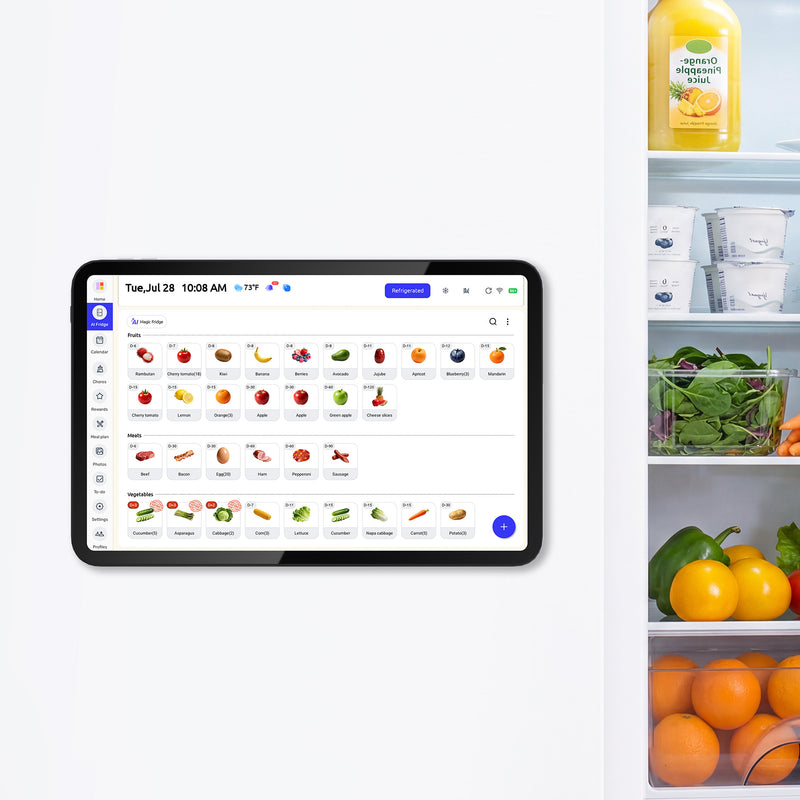
A family calendar works best when it lives inside the flow of real decisions, not on the prettiest empty wall. If your household uses the screen for grocery tracking, dinner planning, and leftover reminders, the wall next to the fridge or the main prep path usually wins because refrigerators should be kept at 40°F or below, so that is where food-safety decisions already happen.

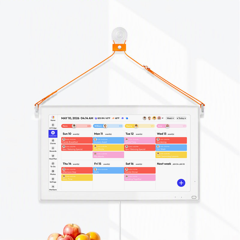
That same logic is why shared kitchen displays tend to outperform decorative hallway installs for busy families. A larger wall unit such as the 21.5-inch family calendar makes sense when several people need to read the screen from across the room, while a compact fridge-mounted calendar fits homes that want meal planning and inventory tracking at arm’s reach.
Mount for bodies, not for symmetry
A clean-looking install usually starts with the screen center 56 to 60 inches above the floor, then gets adjusted after a week of real use. That range puts the display near natural eye level for standing adults without making kids completely miss the lower half of the screen. If shoulders rise when someone taps the top corners, lower it 1 to 2 inches. If adults hunch to read it while packing lunches, raise it 1 to 2 inches.
Use a full-size paper mockup before drilling. Tape it up, run a normal dinner-prep routine, open the fridge fully, and have each household member read the week view from the spots they actually stand. This is the fastest way to catch a placement that looks balanced on the wall but feels awkward when the kitchen is busy.

One SANUS wall-mount instruction manual says the bracket should go only into wood studs, solid concrete, or concrete block, not drywall alone, should be used indoors only, and should go on a wall capable of supporting five times the combined weight of the screen and mount.
Properly lighted work areas matter here too, so check a few basics before drilling:
- Confirm the wall type and total load.
- Use the exact screws or anchors approved for that wall and mount.
- Plan cable routing so cords stay out of the main walking and prep path, and make sure the outlet or power location is reachable without strain.
- Keep the final spot clear of direct sink splash, dishwasher steam, and other persistent moisture.
If wall load, anchoring, or power changes are uncertain, use a qualified installer.
Keep reminders close to action
The more practical your calendar is, the more valuable a readable screen becomes. FoodSafety.gov notes that perishable foods need refrigeration within 2 hours, or within 1 hour if the temperature is above 90°F, so a visible reminder beside the prep zone can support better habits on hectic nights when school bags, takeout containers, and sports practice all collide.
In practice, do not mount the calendar directly in front of the main chopping or plating surface, and keep it just outside the normal food-contact path so checking it does not compete with clean, separate, cook, and chill habits Salmonella and Food.
Leave an easy route between the prep area and the fridge door, because cold food should stay below 40°F and should not sit out more than 2 hours, or 1 hour above 90°F. During a busy dinner-prep period, use the paper mockup for a trial run and make sure reading the screen does not delay putting leftovers, cut fruit, or lunch items back into the fridge. If two people usually work in the kitchen at once, test whether one person checking the calendar blocks the other from getting perishables cold again on time.
Block Daylight Before You Touch Brightness Settings
Treat windows as the first glare source
A reliable rule for shared spaces is that glare must be kept at a minimum, and the simplest way to do that is to stop strong daylight before it lands directly on the screen. If the calendar faces a bright window, move it to a side wall if possible. If the location is fixed, soften the light at the window instead of trying to overpower it with screen brightness.

Roller shades are the cleanest fix when you want a simple, modern look and consistent diffusion. Horizontal blinds give you more directional control, which helps when the problem is low morning sun rather than full-day brightness. Sheer curtains keep a softer, warmer feel, but they cut less glare than a real shade. In a kitchen command center, I usually favor a shade first and decorative softness second.
Test at the three times that matter
Do not judge glare at one convenient hour. Check the screen during breakfast sun, again around midday, and again with the evening overhead lights on. Stand straight in front of it, then 30 to 45 degrees off to each side, because family members rarely approach a calendar square-on.
If one time of day fails badly, note the exact cause. A bright stripe across the glass usually means direct sun. A cloudy white veil often means broad ambient daylight. A sharp circular hotspot usually points to a ceiling fixture. When you identify the type of reflection, the fix becomes much more obvious.
Keep the paper mockup at that 56 to 60 inch center height and repeat the breakfast, midday, and night check before changing hardware. Cornell’s monitor guidance puts the monitor in front of you, so if glare remains, solve it in order: shades or blinds first, a tilt or swivel mount second, matte film or brightness adjustment third, and moving the calendar last.
If reflections still survive those steps, anti-glare filters can dramatically reduce screen-glare problems, but they are usually the third choice rather than the first. In a high-ceiling room, start with window control because overhead contrast is harder to tame with brightness alone; in a hallway pass-through, a side wall often beats a head-on wall because people read while moving. Near a stair opening, prioritize a tilt or side-mount so the screen faces the landing instead of the steepest approach angle, and when low morning or evening sun is the problem, blinds or a shade usually work better than relocating the screen immediately.
Use Softer Artificial Light, Not Just More Light
Covered fixtures beat bare hotspots
Lighting should stay bright enough for safe movement, but lights should be covered with shades or protective fixtures when glare is a problem. That principle applies neatly at home: exposed bulbs, shiny recessed trims, and narrow-beam cans create mirror-like hotspots on glossy or semi-matte screens.
If your calendar sits under a row of recessed lights, try shifting the mount 6 to 10 inches left or right so the strongest reflection falls beside the viewing area rather than across the center of the display. If you are replacing bulbs, frosted bulbs and diffused pendants usually read better on a wall-mounted screen than clear decorative bulbs.
Watch the angles around task lighting
Under-cabinet LEDs, pendant lights over an island, and stove lights can all reflect into a calendar even when the main ceiling fixture looks fine. The fix is usually geometric, not electronic. A small change in mount height, a slightly different tilt, or moving the screen off the direct line between your eyes and the fixture can remove the reflection completely.

This is where a tilt or swivel mount earns its keep. A fixed mount looks cleaner and costs less, but mixed-height households and bright kitchens often benefit from a little adjustment. If adults read the calendar while standing and kids check chores from a lower angle, a modest downward tilt can make the screen easier for everyone to read.
Keep heat and steam in mind
A readable setup also has to survive the room. Shared-space lighting and ventilation rules call for areas to stay ventilated and for cooling help when temperatures rise above 84°F, with fans or air conditioning available over 84°F. In a home kitchen, that translates to a simple warning: avoid the wall that catches oven heat, dishwasher steam, or direct sink splash if you have another option.
Choose the Right Screen Finish and Mount Style
Matte helps, but placement still matters more
An anti-glare or matte finish is worth having, especially in kitchens with windows, recessed lights, and lots of movement. But it is not magic. A weak glossy panel in a bright room will still look like a mirror, and even a good matte screen can wash out if it faces direct sun head-on.
For shared family use, I would choose in this order: good glare handling, enough brightness for the room, then a size that matches your reading distance. That means a 21.5-inch wall screen makes more sense for across-room schedule checks, while a compact fridge model works well when the user stands close and treats it like a meal-planning station.
Know the hardware trade-offs
A fixed mount is the tidy choice. It is less expensive, looks built-in, and works well when the wall, user height, and lighting pattern are all stable. A tilt or swivel mount is the practical choice when different family members use the display from different positions or when daylight changes sharply by season.
Aftermarket matte films can help when you already own the screen, but they are a compromise. They usually reduce reflections somewhat, yet they can also soften text sharpness and do nothing for poor off-angle viewing. Factory screen coatings generally look cleaner. If you try a film, patch-test a corner first and check both readability and touch response before committing.
Match the format to the room
The 21.5-inch wall calendar is better for a kitchen command center that also shows the week plan, chores, and meal list to multiple people at once. The 13.4-inch fridge calendar is better when counter space is tight and the main goal is quick interaction right at the fridge door. Neither format is automatically better; the right one depends on viewing distance, wall options, and how many people need to read it at once.
Troubleshoot the Most Common Glare Mistakes
If the screen looks fine by day but bad at night
Night glare is usually an overhead-light problem. Look for a ceiling fixture or pendant reflecting straight into the glass. Lowering the calendar slightly, changing bulb style, or shifting the mount a few inches often fixes this faster than changing brightness settings.
This matters more than it seems because a kitchen calendar is not just decor. FoodSafety.gov says 1 in 6 Americans get food poisoning each year, so reminders about leftovers, lunch prep, and cleanup should be easy to read when the household is tired and moving quickly.
If the screen is readable only from one spot
That usually points to a viewing-angle or mount problem. First, test the screen from the main prep area, the table, and the doorway. If one person can read it only while standing dead center, the display may need a slight tilt, a different wall, or a larger size.
A shared calendar is especially useful for foods that are easy to overlook, because the FDA notes that many items other than meats, vegetables, and dairy products need to be kept cold. Opened dips, cut fruit, leftovers, and ready-to-eat lunch items are exactly the sort of things a family calendar can track well, but only if the screen is legible from where those decisions happen.
If the calendar disappears in morning sun
Morning washout is almost always a window issue. Add a shade, rotate the calendar to a side wall, or move it out of the direct reflection path. Do not keep raising brightness to fight full sun; that usually creates a screen that feels harsh later in the day.
A good rule of thumb is simple: if you have to cup your hand over the screen to read the meal plan, the room is telling you something about placement. Fix the light first, then refine the display.
Practical Next Steps
A durable setup needs a little maintenance. Clean the screen and nearby light fixtures regularly, because dust increases haze and makes a mild reflection look worse. Recheck glare when seasons change, when you swap bulbs, or when you add new under-cabinet lighting. If the calendar supports meal plans and fridge reminders, review the layout every few months so the most time-sensitive items stay in the easiest-to-read zone.
Leveling up usually means making the calendar more intentional, not more complicated. Add a dinner strip, a leftovers reminder row, or a grocery list widget that sits in the lower half of the screen where glare is least likely. If cords bother you, use a paintable raceway or place furniture below the screen so the setup looks finished rather than improvised.
Action Checklist
- Tape up a full-size paper mockup and test it during breakfast, midday, and evening light.
- Start with the screen center 56 to 60 inches above the floor, then adjust by 1 to 2 inches after a week.
- Keep the calendar near the fridge or prep path if it handles meal planning, leftovers, or grocery reminders.
- Add shades or curtains before raising screen brightness.
- Shift the mount away from direct reflections from recessed lights or pendants.
- Choose a tilt mount if multiple heights or viewing positions make readability inconsistent.
- Recheck glare after any bulb, window-treatment, or furniture change.
FAQ
Q: Is a matte screen enough to solve glare on its own?
A: No. A matte screen helps, but direct sunlight and bad fixture angles can still wash it out. Placement and light control usually do more than screen settings alone.
Q: Should I mount the calendar in the kitchen or the hallway?
A: Choose the place where decisions happen. If your calendar carries meal plans, grocery notes, chores, and “put this away now” reminders, the kitchen usually gives it more daily value.
Q: What is the biggest placement mistake?
A: Mounting for wall symmetry instead of household workflow. A beautiful centered install that catches window glare or sits too high will be used less than an off-center setup that reads clearly every day.
Safety & Warranty Disclaimer
This installation and decor guide is for general reference and creative inspiration. Physical home modifications carry inherent risks, including structural damage or electrical hazards. Always prioritize your product’s official installation manual and ensure compliance with local building codes. If you are uncertain about performing a task, please seek assistance from a certified professional. [Brand Name] is not responsible for any damage or injury resulting from DIY applications of these suggestions.
References


