



Mount your digital calendar on the wall that sits in the natural path between kitchen, entry, and living areas, then set the height for both visibility and touch use. In open layouts, location matters more than screen size.
If your family keeps missing handoffs, practices, or pickup times, the problem is usually not the calendar app. It is that the schedule lives in private phones instead of a shared sightline. You will get a practical placement method here, plus a simple one-week test that helps you mount once and mount right.

Define the Calendar’s Job: Quick Glance vs Interactive Planning
Start by choosing the calendar’s primary job. In open homes, this single choice prevents most bad placements.
- Use Quick Glance if your goal is passive visibility.
- Use Interactive Planning if people will touch the screen daily.
For Quick Glance, place it where people pass 8-15 times a day: between kitchen prep space and the path to the front door usually works best. For Interactive Planning, prioritize a stop point, not a pass-through point, so two people can stand in front of it without blocking circulation.

A practical rule: if people need to turn their body more than about 45 degrees to see it during normal movement, it is too hidden for an open-concept plan.
Build a Command Zone Without Adding Visual Clutter
Treat the area like a compact workstation, not a single floating screen. That keeps the wall intentional and visually calm.
- Pick one anchor wall and keep all support items within about 3 ft left or right.
- Set touch height around center-screen 52-58 in from floor for mixed adult/child use.
- Keep a clear standing zone of about 24-30 in in front of the display.
- Confirm nearby power before final mount.
- Check glare at breakfast time, mid-day, and after sunset.
Material trade-offs matter:
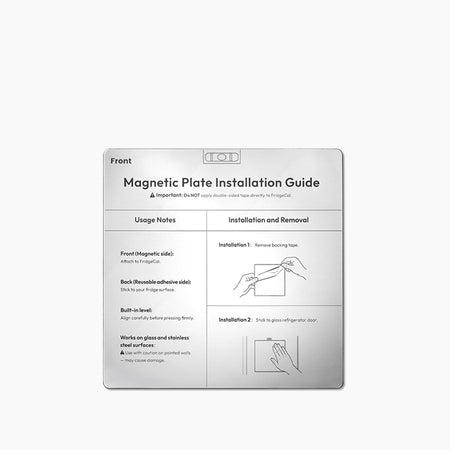
- Stud mounting gives the cleanest long-term stability.
- Drywall anchors are fine for lighter units but can loosen with frequent touch pressure.
- Matte screen protectors reduce reflections but can soften image sharpness slightly.
- Cable raceways look cleaner than loose cords but require careful paint matching.
Common miss: putting the calendar in a “quiet wall” that looks nice but has weak daily traffic. In open layouts, usefulness beats symmetry.
Evaluate Big-Screen Shared Hubs (e.g., Everblog 21.5" Digital Calendar)
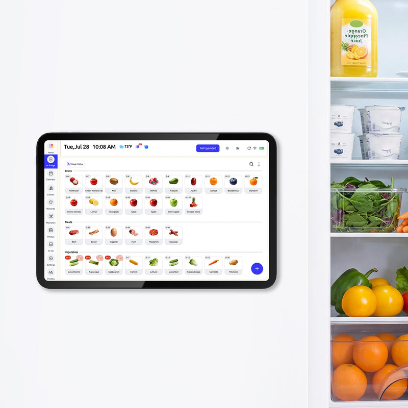
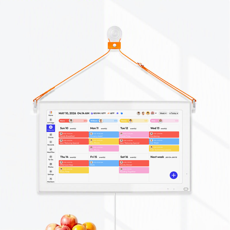
A large wall display makes sense when your household is merging multiple schedules and needs a true shared view. A hub like the a company is positioned for that role, with wall-mounted use in kitchens, living rooms, or hallways and sync support for common calendar platforms.

Use this checklist before buying:
- Can everyone read it from the main traffic lane?
- Does it sync your actual mix of calendars, not just one account?
- Is touch response reliable at your mounting height?
- Can the wall and outlet location support a clean install?
- Does it still look intentional when the room is busy?
If your open floor plan is visually minimal, frame style and cord management will affect satisfaction as much as software features.
Run a 7-Day Placement Test Before Final Mounting
Do a no-drill test first. Tape a paper template at candidate locations, then run normal life around it for one week.
Day |
What to test |
Pass signal |
Fix if it fails |
1 |
Morning visibility |
Seen during coffee/breakfast |
Move closer to kitchen traffic |
2 |
Exit check |
Seen before leaving home |
Shift toward entry path |
3 |
Reach and touch |
Shortest family member can use it |
Lower center height 2-4 in |
4 |
Crowd flow |
Two people can check without blocking |
Move to wider wall segment |
5 |
Glare |
Readable without squinting |
Rotate wall choice or add shade |
6 |
Night use |
Legible in evening lighting |
Add nearby task light |
7 |
Habit check |
Family checks it without reminders |
Relocate to higher-traffic wall |

Troubleshooting during the test:
- If usage is low, the spot is wrong, not the family.
- If kids ignore it, lower it and place chore/task items beside it.
- If adults ignore it, move it closer to entry or coffee route.
- If it feels messy, reduce adjacent items to only daily-use tools.
Support the Calendar with Adjacent Drop-Zone Essentials
A command center works best when it handles the next action, not just the schedule. Add three physical items: key hook rail, mail tray, and a small note pad or quick-capture list.
In kitchen-adjacent zones, include a tiny food-safety card because a 40°F fridge and 0°F freezer baseline helps families make fast, safer storage decisions during busy weeks.
A leftover label marker near the calendar is also useful because leftovers last 3-4 days in normal refrigerator storage, and that single reminder cuts waste and guesswork.
If your command zone includes meal reminders, add one reheating note: leftovers reach 165°F before serving.
Key Takeaways
- In open layouts, mount where family traffic already happens, usually kitchen-entry-living sightlines.
- Decide job first: Quick Glance placement differs from Interactive Planning placement.
- Run a 7-day no-drill test before final mounting to avoid rework.
- Keep the zone tight and clean with only high-frequency support items.
- Maintain weekly with a quick screen wipe and monthly with a placement/glare recheck.
- Level up by adding color coding, a 10-minute Sunday planning reset, and one clear household routine around the display.
Safety & Warranty Disclaimer
This installation and decor guide is for general reference and creative inspiration. Physical home modifications carry inherent risks, including structural damage or electrical hazards. Always prioritize your product’s official installation manual and ensure compliance with local building codes. If you are uncertain about performing a task, please seek assistance from a certified professional. [Brand Name] is not responsible for any damage or injury resulting from DIY applications of these suggestions.


